With 2022 just around the corner, change is on the horizon. Everywhere you look, the world is becoming more and more complex. Now, more than ever, your home is your haven. Why not use the new year to break away from old tradition by breathing new life into your home’s decor? With the spirit of change in mind, the Pantone Color Institute went in search of a color that would properly represent the upcoming new year, a color that communicated both a calming sense of familiarity and novel excitement. Introducing the Pantone 2022 color of the year, Very Peri.
The 2022 Color of the Year: Very Peri
For the last 22 years, the Pantone Color Institute has gone about the difficult task of selecting the perfect color to represent each incoming year. To that effect, Pantone’s color experts, known for their development of the proprietary color matching system used as a standardization tool by industries the world over, have employed an exacting method to choose their yearly representative. Part cultural zeitgeist, part meticulous attention to global color trends, their yearly representative is both an exercise in passionate creativity and scientific use of color theory.
This year is a first for Pantone. The company boasts over 2000 unique and standardized colors. It created a brand-new lot for their 2022 color of the year rather than selecting a pigmentation from their extensive catalog. Thus, the birth of Pantone 17-3938, also known as “Very Peri,” a decidedly periwinkle color of the year.
Very Peri is a derivative of traditional periwinkle; the color of the year falls along the purple arm of the color spectrum. It’s a choice that everyone from professional designers to do-it-yourselfers is embracing wholeheartedly.
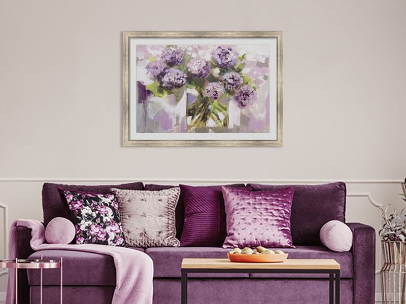
Blush Hydrangea by Amanda J. Brooks
Periwinkle Color of the Year Attributes
Traditional periwinkle colors include a mix of violet hues and blue undertones. But Very Peri isn’t a purely traditional choice.
There’s a tumultuous nature of modern-day life. So it was very important for the professionals at Pantone to select a color scheme that appropriately reflected the hope that comes with change rather than the more negative anxiety associated with the large-scale transition. To that effect, the blue tones in their periwinkle color of the year serve to anchor Very Peri. It communicates a year of new beginnings.
What makes this particular gradient novel is the mixture of violet-red overtones added to the softer, cooler blues. The result? An optimistic color that is both comfortable and exciting. There’s no better way to leave behind a year of strangeness and upheaval than by incorporating Very Peri into your living space.
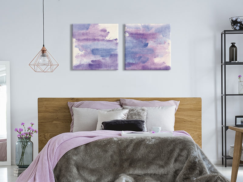
Purple Haze 2 Piece Canvas Print Set by Chris Paschke
Implementing Very Peri Into Your Home’s Interior Design
2022 has already started. Home decor suppliers around the world are embracing Pantone’s periwinkle color of the year. Everything from framed wall art to software manufacturers is racing to incorporate the new color scheme into their products. For example, Pantone has partnered with Microsoft to help promote Very Peri. Partnerships like these not only speak to the diversity of the Very Peri tone but its versatility as well. It is a color easily adaptable to your existing home decor.
Very Peri looks to make a significant mark on our culture in the coming year. Its soft, blue base —and a hint of striking red— are the perfect way to accent a room adorned with neutral whites, off whites, or earth tones. The mix of blue, violet, and red adds a streak of visual comfort. It also mediates between your home’s more complex colors. When used sparingly, especially in framed wall art, Pantone’s periwinkle color of the year is the perfect way to spruce up your building’s interior with a familiar yet challenging hue.
