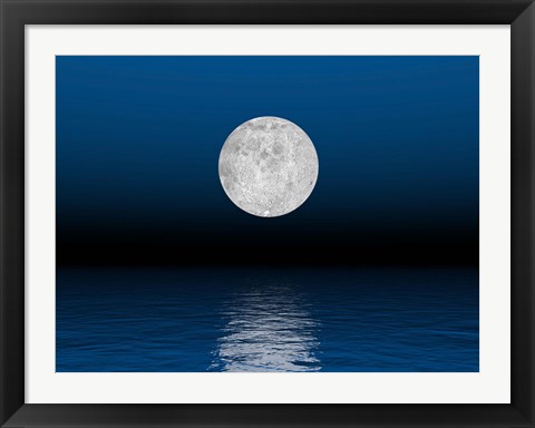
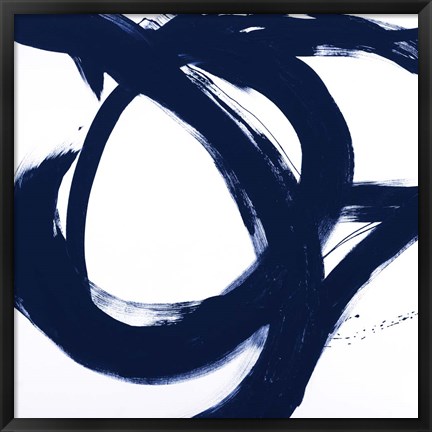
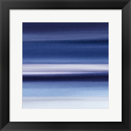
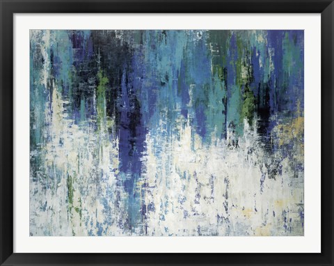
New year, new blue! Today, we’re here to dive into the bright and vibrant Pantone color of the year: Classic Blue. We have to admit: we’re big fans. The color blue has naturally calming properties already, and this shade is especially serene. This post will highlight some of our favorite blue art, and try to convince you to flood your home with more blue this year!
Pantone’s Pitch for Classic Blue
It didn’t take much to sell us on Classic Blue, but if you’re still not sure, maybe this will help:
According to Pantone’s website, “The thoughtful and meditative Classic Blue helps induce a gently calming effect and feelings of peaceful tranquility to the human spirit.”
But that’s not the only way Classic Blue plays it. Pantone’s website says that when paired with brighter greens and coral oranges, this shade “transports us to an idyllic destination,” akin to snorkeling off of the shores of the Bahamas.
Alternatively, Pantone’s Classic Blue can be mixed with soft purples and grays to mimic the evening sky, or combined with pinks, yellows, greens and reds to reflect the shades of natural seasonings and condiments. This particular palette, Pantone says, reflects a relationship to “wellness and self-care, to help build a solid foundation and act as a form of protection for good health.” Though it may be a bit of a stretch, we’ll give it to you, Pantone. Blues are a nontraditional decor color in eating areas, but if any blue could pull it off, this would be it.
A Classic Blue Controversy
Not everyone is on board with Pantone’s color pick. Nicole Brown, Fast Company contributor, calls Pantone’s Blue the “color equivalent of watching Friends.” Although that sounds okay with us, Brown claims that Classic Blue is better as background noise than a feature presentation. Pantone’s pick for the past to years, Nicole brown argues, has been much more culturally relevant. 2019’s Living Coral represented the juxtaposition of the natural world as well as our lives on social media, and 2018’s Ultra Violet represented “the intrigue of what lies ahead.” Brown believes that Classic Blue is a look backward instead of a step forward.
But why not take a look back? Pantone may want us to be willingly nostalgic. Blue has been a staple color of the United States of America, as well as many other countries, for years. It’s arguably the world’s favorite color. Everyone is always willing to jump into a refreshing sea of blue (not to mention it matches almost anything in your wardrobe.) The passiveness of blue doesn’t have to be a bad thing–it can be a place where we find comfort.
This is especially true when it comes to wall decor. Hanging framed art with a blue hue promotes calm–a feeling of being at home. In a world where everything is changing all the time, a feeling of sameness, of the comforts of home, may be welcome.
Where to Hang Pantone’s Classic Blue
The quick answer? Anywhere! But if you want to get more detailed, here are a few places in your home to consider adding some blue:
Bedrooms. Blue in the bedroom can actually help you sleep, especially after a day of overstimulation. Blue can be especially calming in the bedroom of a child or a baby. Consider a simple pattern without too much business to rest your eyes upon after a long day.
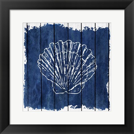
Bathrooms. This may be the most obvious choice, especially with the popular, nautical themes of many bathrooms. Classic blue goes well with cottage-y, beach-y color schemes that need a pop of color.
Classic Blue, we love you! How will you incorporate Pantone’s official color of 2020? May this color, and the new year on a whole, bring more calm and tranquility to your life!

