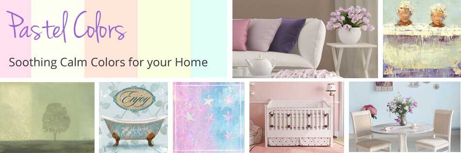
About Pastel Colored Art
Pastel colors belong to a palette characterized by their low to medium saturation and high brightness, resulting in hues that are soft, calming, nearly neutral, and muted. Notable examples include serenity blue and rose quartz, both of which are exceptionally light variants of their base colors. The gentle and soothing nature of pastels creates an inviting atmosphere, making them a perfect choice for any space, particularly in a baby's nursery or a child's bedroom!
When it comes to decorating a nursery, pastel hues are a top choice due to their wide range of shades and the ability to mix and match them to establish a thematic presence in the room. Moreover, pastel art finds a harmonious place in bathrooms, where the goal is to foster a tranquil and relaxing environment. The use of pastels in these spaces promotes a sense of calm and relaxation.
ComplimentaryComplementary colors that enhance pastels include earth tones such as creams, browns, and shades of green with an earthy feel. These subdued earth tones serve as an excellent backdrop, accentuating the pastel elements within an artwork. Opting for mats in natural colors like brown and cream can make a pastel artwork pop. To complete the look, choose frames in understated colors such as black, silver, gold, or brown, which can bring focus to the artwork's playful and vibrant pastel hues.
Suggested Boys Colors
Suggested Girls Colors
Pastel Rooms
Pastel Rooms
When it comes to decorating the room with pastel art, the most important thing to consider is the mood you are trying to create with your paintings. It is important that you are remember that pastel colors can create a relaxing and soft mood. When it comes to pastel colors, your best bet is to use art with yellow, blue, and green hues within them. Not only do such colors give the home a new dimension, but they also create an atmosphere that's both warm and relaxing. Whether it's the nursery room for your baby or your living room, you can also use pastel art against pastel colored walls. This gives the entire living space a warmer feeling. If you use the right creativity with the correct light and dark tones complementing each other, you can give your rooms your own twist on this fantastic color combination.

Using Pastel Art in a Nursery
Pastel Nursery
Pastels have always been the best go to option for decorating a baby's room. One main question we ask ourselves when decorating the nursery is pink or blue? As we all know these two colors are the favored theme for babies and their nursery, with blue being used for baby boys and pink for baby girls. Due to this, the majority of parents tend to look over all other pastel colors all together and tend to go for something that's interesting as well as precious. A light colored nursery will benefit with lovely soft sahdes of pastels. Use other shades of pastels, like soft yellow, green, lilac, and neutral hues to highlight the accents of pink and blue pastel themes within the room. Also, using word art, animal prints and floral prints are great options for subject based artwork that adds to the overall color scheme of decorating with pastel colors.
The finish of the room needs to complement the pastel art as well as the bed frame, drapes, and comforter. To ensure all these things synchronize correctly, you should coordinate the colors in your current decor with your artwork to enhance the beauty and warmth of the nursery. If your nursery is similar to this light colored nursery, then this calls for some attractive and exquisite pastel animal wall decorations. Adding this charming touch to your babys light-colored nursery will create a warm and welcoming effect that will surround your little one with beauty.
Create a contrast to these pastel shades by using gray colors. Not only will it present sophistication but it will also give your nursery a modern edge. You might be thinking that this will end up looking masculine but the color, in fact, actually creates a feminine feel of a white and traditional pastel blend. This makes gray the perfect choice for gender-neutral nurseries especially when paired with bright accents.
Sleeping Baby IV - Rabbit
Out of Stock
Using Pastel Art in a Girl's Nursery
Girl's Nursery
When it comes to decorating your little girl's nursery, consider everything from the pastel colors, furniture, and additional decoration. We all know that this is the age girls love to have everything pink. Ao why not bring in a range of rose quartz, lilac, lavenders, and even lime yellows to have a colorful pastel burst! A fantastic range of pastel animal wall art prints can give the room a sweet and innocent feel. Combine this wil a theme that includes birds, butterflies and flower art to finish her girlie look. The soft and warm pastel colors used in these works of art are brilliant and not too harsh to incorporate into your little girls nursery. Most importantly create that fun and playful environment your little one can enjoy!
Deer Baby girl
Out of Stock
Using Pastel Art in a Boy's Nursery
Boy's Nursery
Just like a girl's nursery, a baby boy's nursery has endless amount of decorating options! When it comes to decorating your little boy's nursery, this certainly calls for a baby blue color theme. For example, if you have accents of light blue furniture throughout the room, colored prints within the same family of blue or similar subject matter can compliment and enhance your current decor. Shades of green, yellow, and natural hues are great matting options for baby blue art prints. Consider adding solid colored frames like a black frame to balance out the bright colors of the print. Hang a series of art with matching mats and frames to create a unified theme of art on your wall.
Green, baby blue, and yellow colors are perfect examples of pastel colors for a little boys nursery. A single soft color such as powder blue or mint can add a pop of color to your space. Pastel art with animals, circus, planes, and trains can beautifully compliment the nursery's current decor while adding a theme. If your crib and dressing table is a little, lets say earthy toned with pastel colors like blue, green, and yellow, using pastel art will not only give your baby a warm and elegant room, but also one that has that has a tinge of masculinity. When using pastel colors it is important you do not use dark shades or those that are too light. In order to form the perfect combination you should try experimenting with both dark and light shades of one color scheme.
Bear Boat
25" x 16"
Price: $191.99
Sale: $163.19
Using a Series of Pastel Art
Pastel Series
Let's explore the art of storytelling through pastel colors! Who says you must stick to either solely light or dark shades in pastel art? It's your space, and you have the freedom to make it as subdued or as vibrant and diverse as you desire. This is the essence of employing a series of pastel artworks, and the key is in the name itself—a series indicates utilizing multiple pieces, whether within a single room or distributed throughout your home. Opting for a series of pastel art involves selecting works that share a common subject matter yet each brings its unique color palette and charm. This approach allows you to weave together themes like animals, florals, or word art to achieve a cohesive series effect. Employing mats of identical color shades within each piece can highlight the dominant hues, while matching mats and frames across all pieces ensure a uniform look throughout the space.
When it comes to decorating with a series of pastel art in the bathroom, you can choose from the floral artwork, as well as blooming flowers, elegant flowers, a color burst of nature or even a touch of Paris. Using a series of pastel work not only helps expand a room, but also looks ever so elegant and unique. You may be wondering how it expands a room. Well, let me tell you this, if you had over five pastel wall arts in one room with the same theme and image wouldnt that be a little, lets say dull? One or two would be brilliant, but anything over three is a definite no-no.
The reason to this is because both the eyes and mind feel happy when seeing something new, so wouldnt it be better to have a little bit of nature, floral paintings, your passion and personality in front of your eyes and in the form of pastel art? This expands a room as you explore the look and feel of colors in each artwork. This also unites the style as the series can beautifully coordinate with any new and existing and will not need changing as long as all the right colors are there. When using a series of pastel art, it is important you experiment with both dark and light shades as you really do not want each picture to boast the same appearance and the same shades. To do this, you need to mix and match with both light and dark shades so you have a bit of everything there.
Remember, spaces like the living room, dining room, study, and especially the bathroom, play significant roles in your home. Treating the bathroom with the same decorative attention as other key rooms can transform it from merely functional to a stylish statement space. Even a small bathroom can appear more spacious and elegant with the right selection of pastel art. By choosing the perfect pastel hues and art pieces, you can create the illusion of more space effortlessly, making your bathroom not just functional but also a reflection of your style and taste.
Using Pastel Art in a Small Bathroom
Small Bathroom
A bathroom is the next best place to use pastel art! For smaller bathrooms, it is best to avoid too much dark colors and concentrate mainly on the lighter and cooler shades. This helps make the bathroom feel more spacious and also gives you a chance to make the change with a series of pastel artwork. The sizes of artwork that should be used for smaller bathrooms can range from small square, small rectangle, and those that are long in height. Alternatively, a larger bathroom boasts more space, but this does not mean you entirely cover up the area with pastel wall art, oh no! Use wider frames with any print to balance out the size and space within the room. Using complimentary pastels is perfect as this not only blends in according to the theme, but also looks brilliant when decorating with a range of pastel art.
The main colors of bathrooms tend to be lilac, whites, lime yellows, light blues and mint greens. This is because dark colors tend to make a room feel small, tight, and cramped, which is why we want to avoid this. The beauty of pastel colors are they can easily reach out to every corner in the room, which has the room appearing and feeling bigger. Any light pastel color used will certainly have the bathroom appearing much larger than it is. However, using bright pastel colors such as yellow can instantly make the bathroom seem more open and pop. The secrecy behind bright colors is they allow you to choose from a variety of decorating themes and also help pull the eye away from the size of the room, which makes it appear bigger. For example, a bright color like lime green helps make the room feel more open and lively.
Using complimentary pastels is perfect as this not only blends in according to the theme of any room, but also looks brilliant when decorating with a range of pastel art. Pairing earth tone mats that highlight the bright pastels within a print make the color palette stand out and finishing it off with a solid colored frame like black or silver creates a completed look that really brings out the pastel art!
Spa Setting II
Out of Stock